RTJ Wellness Brand
Official guidelines for how the RTJ Wellness brand is represented visually and verbally across all materials and media.
Logo Suite
The RTJ Wellness logo is available in multiple formats. Use the light version on dark backgrounds and the standard version on light backgrounds.


Icon Marks


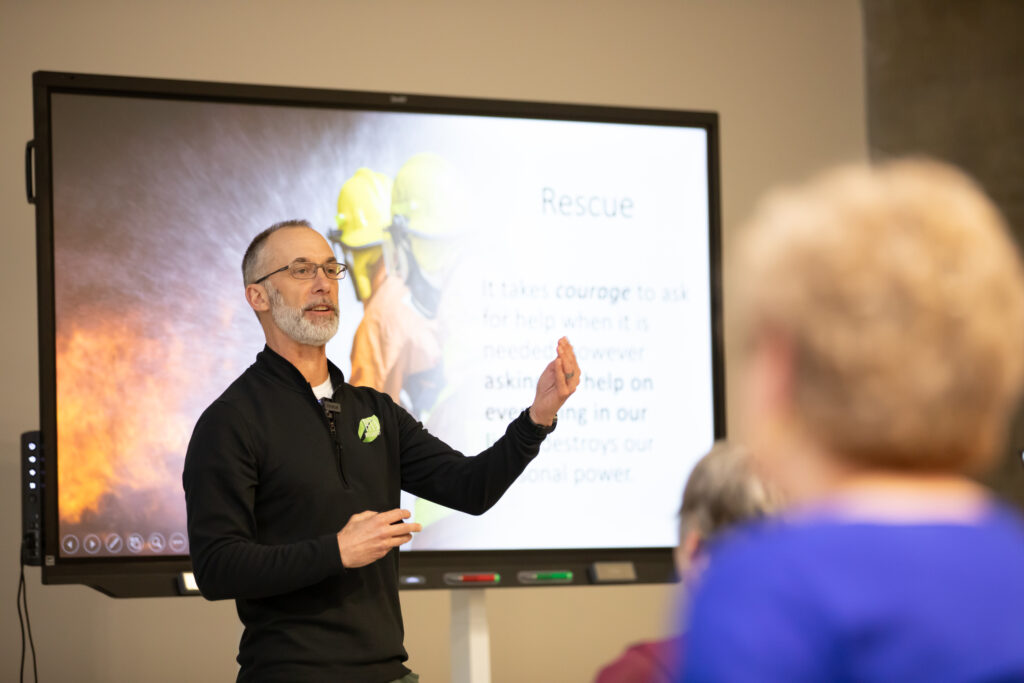
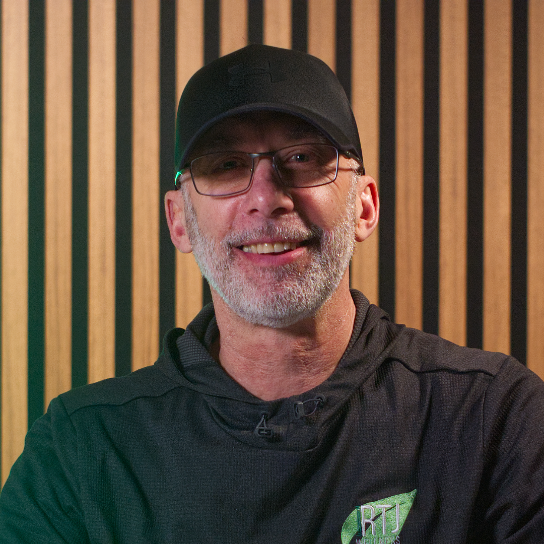
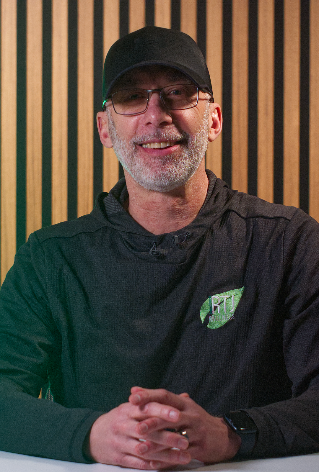
Founder Photography
Official headshots of Rob Jetten for use in bios, event programs, press materials, and speaker introductions. Available in two crops with an optional textured background variant.


Color Palette
An earthy, organic palette that communicates warmth, trust, and professionalism. Click any color to copy its hex code.
Primary Colors
#7A8B6F
#3A3228
#FEFCF9
#C4703F
Supporting Colors
#A3B18A
#DAD7CD
#5C4F42
#F5F1EB
Typefaces
Two typefaces define the RTJ Wellness brand. Merriweather carries headings and emphasis. Outfit handles body text and interface elements.
Brand Voice
RTJ Wellness communicates with warmth, clarity, and credibility. The founder’s authentic voice is central to the brand identity.
Warm, Not Corporate
The brand speaks like a trusted colleague — empathetic and encouraging, without being soft or vague.
Practical, Not Theoretical
Content leads with what people can actually do. Every piece of communication should include a clear, actionable takeaway.
Credible, Not Preachy
Trust is earned through experience and evidence, not authority. The brand shares what works without lecturing.
Inclusive, Not Exclusive
Wellness is for everyone. Communications avoid jargon, gatekeeping, or language that implies a prerequisite.
“Interactive” as a Through-Line
The word “interactive” is the brand’s key differentiator and should appear consistently in workshop descriptions and marketing.
Founder-Led Authenticity
The brand’s voice reflects the founder’s conversational, grounded tone. Communications that feel over-polished dilute this strength.
Brand Name Usage
Consistent naming across all materials reinforces recognition and trust.
The preferred full expression pairs the business name with the founder’s name, reinforcing the personal, facilitator-led nature of the service.
Visual Standards
RTJ Wellness is a human-led service. All visual materials should reflect authenticity, warmth, and real engagement.
Websites, brand identity and more for growing brands.
mountainthirteen.com